


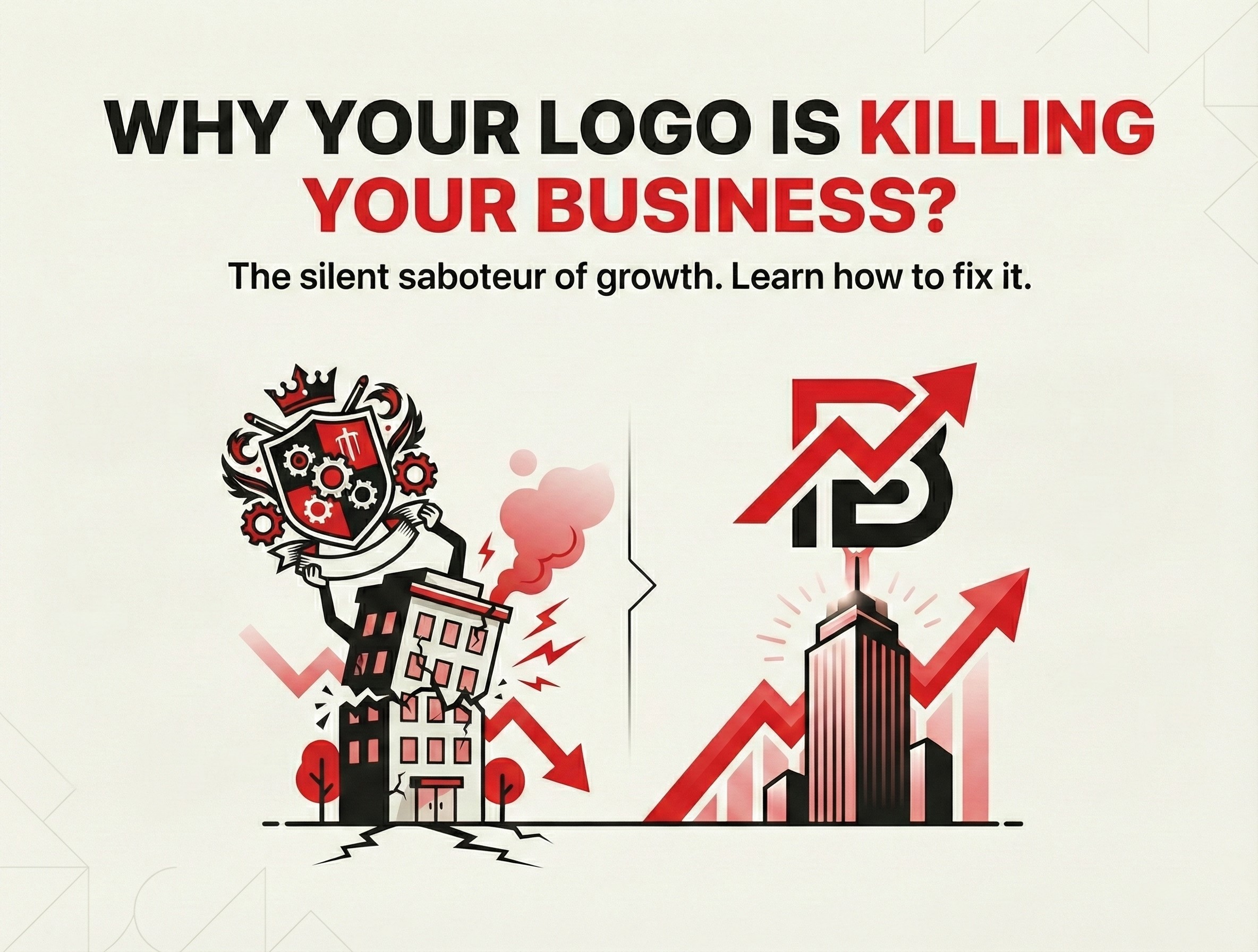
What if the very symbol meant to represent your brand’s strength is silently eroding customer trust and tanking sales? In a world where 75% of consumers form their first impression of a business from its logo alone—according to a 2023 Stanford study—yours could be the hidden culprit behind stalled growth. Picture scrolling past a cluttered, outdated design that screams “amateur” amid sleek competitors; that’s not just lost clicks, it’s millions in missed revenue. Businesses with poor logos see up to 30% lower conversion rates, per HubSpot data, because they fail to convey professionalism at a glance. Don’t let this design disaster define your destiny—PxlBrief reveals why it’s happening and the proven fix to reignite your brand’s potential.
The Hidden Costs of a Subpar Logo
Your logo isn’t mere decoration; it’s your brand’s silent salesperson, working 24/7 across digital and physical touchpoints. When it’s poorly designed—think mismatched fonts, low-resolution pixels, or colors that clash on mobile screens—it triggers subconscious rejection. A 2024 Nielsen report found that 94% of first impressions are design-related, with ugly or confusing logos driving 20-25% of potential customers away before they even engage. For e-commerce brands, this translates to cart abandonment rates spiking by 15%, as trust evaporates instantly. We’ve seen clients at PxlBrief lose thousands monthly to logos that dilute their message, turning high-potential leads into forgotten tabs.
Common Logo Killers Exposed
Outdated aesthetics top the list: 60% of logos over five years old feel irrelevant in today’s minimalist-driven market, per Design Rush analytics. Scalability issues plague another 40%, where intricate details blur on favicons or social avatars, eroding recognition. Color psychology matters too—using “wrong” hues like aggressive reds in wellness brands can repel 35% of audiences, based on Colorcom studies. Overcomplication compounds it: busy designs increase cognitive load, slashing recall by 42% in eye-tracking tests from the Journal of Marketing. These flaws aren’t just annoying; they sabotage your business’s perceived value and market edge.
The Game-Changing Fix: Strategic Redesign
The antidote lies in a logo audit and redesign rooted in data-driven strategy, not guesswork. Start with audience analysis to align colors, shapes, and typography—simple geometrics boost memorability by 28%, per Adobe research. Prioritize versatility: vector formats ensure crisp scaling across billboards to apps. Test iteratively with A/B tools; our PxlBrief clients achieve 40% higher engagement post-redesign by refining based on heatmaps and surveys. Invest in professional expertise—DIY tools fall short, delivering only 22% of pro-level impact, Forrester notes. This fix doesn’t just refresh; it unlocks revenue, with redesigned brands reporting 25-50% sales lifts within six months.
Conclusion
A flawed logo isn’t a minor oversight—it’s a revenue assassin stifling your growth. By auditing pitfalls and embracing strategic redesign, you reclaim trust, boost conversions, and propel your business forward. Partner with PxlBrief for expert guidance that turns design weaknesses into competitive superpowers. Ready to revitalize your brand?
Tagged with :